Now in Peach
Teardown
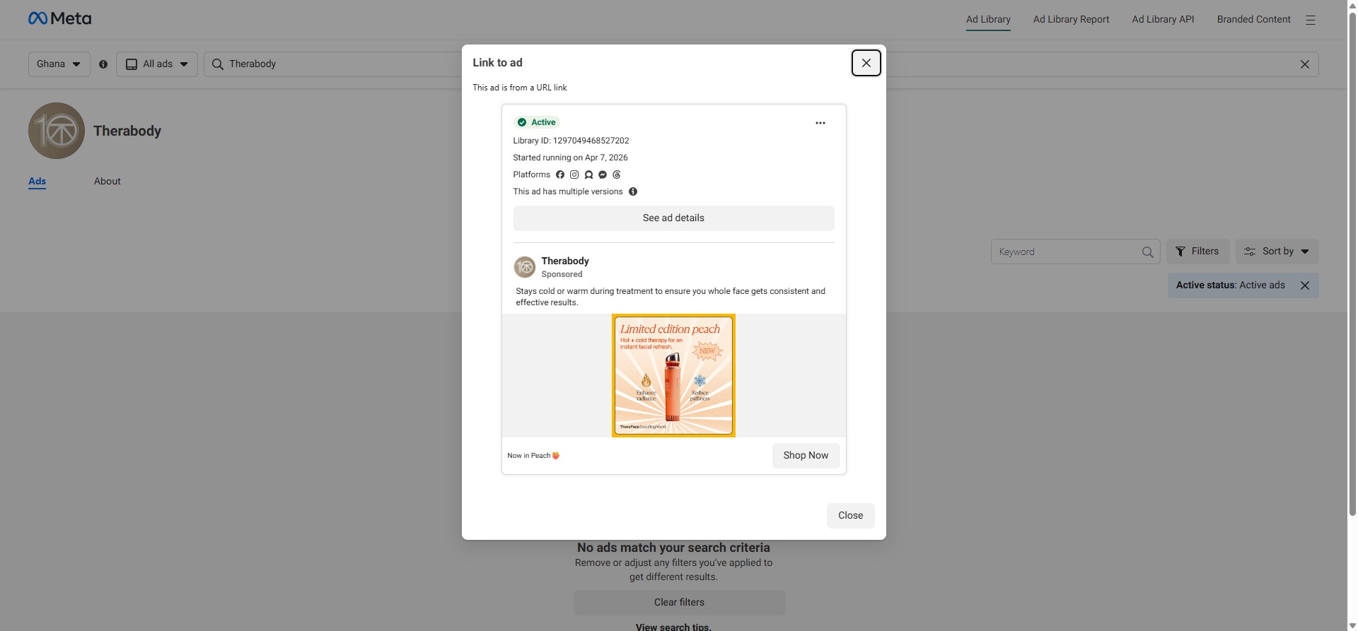
"Stays cold or warm during treatment to ensure you whole face gets consistent and effective results." The body copy opens with a functional differentiator that directly addresses the category's most common consumer complaint: inconsistent temperature performance. Hot and cold therapy devices — from jade rollers to cryo wands — frequently fail at sustained temperature delivery. By leading with "stays cold or warm during treatment," Therabody is speaking directly to a reader who has already tried and been disappointed by a device that warmed up too fast or cooled down too slow. The claim doesn't require the reader to trust Therabody — it just has to confirm a suspicion they already hold about the category.
"Whole face" is a meaningful word choice. Facial devices marketed with temperature claims are typically positioned for zones: under-eye cryo, forehead cool-down, jaw tension relief. "Whole face" claims geographic completeness, which implicitly makes the competing zonal approach look partial. This reframe raises the reader's implicit standard for what a facial recovery tool should do before they evaluate Therabody against it.
The limited edition peach colourway is doing significant commercial work in this ad. "Now in Peach 🍑" as the link description turns a colour variant into a news event. Limited edition colourways are a proven DTC lever: they create urgency without a discount, they give existing customers a reason to return, and they generate social media sharing from unboxing and gift-giving contexts. The peach execution here is particularly well-timed — pastel device colourways are a demonstrated trend driver in the wellness tech category, and the warm-toned peach reads as both premium and approachable against Therabody's otherwise clinical black-and-white identity.
The creative leans into the colourway fully: the product is front-and-centre against a warm gradient background, with "Limited edition peach" as the headline and "Hot + cold therapy for an instant facial refresh" as the subtext. The two callouts — "Enhance radiance" and "Reduce puffiness" — frame the outcome in beauty-vertical language rather than recovery-vertical language, which signals a deliberate audience expansion move: this colourway is designed to pull in a buyer who shops skincare, not just a buyer who already owns Therabody recovery equipment.