Transform your home with our machine-washable geometric rugs.
Teardown
The primary text opens with a two-beat sequence: "From cozy mornings to unexpected spills—Ruggable's rugs are ready for real life." The dash is doing structural work. "Cozy mornings" is aspiration — the rug as part of an interior you want to inhabit. "Unexpected spills" is the category entry point — the moment that sends someone to Google "washable rug." Ruggable connects both ends of the emotional arc in a single sentence, naming the idealized use case and the practical failure mode in the same breath. That construction acknowledges the buyer's actual experience without reducing the product to a stain-management tool.
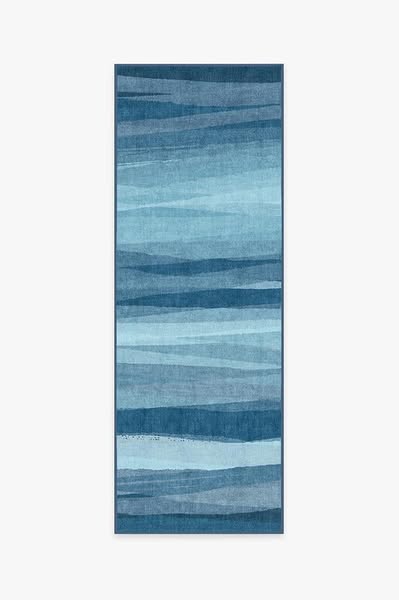
The creative is a product-on-white shot: a runner rug, vertical format, blue watercolor/wave pattern with layered horizontal bands moving from pale slate to deep navy. No room, no person, no floor context. The format is deliberately neutral. Product-on-white lets the buyer project the rug into their own space — a runner that has not already been placed in someone else's hallway belongs to whoever is looking at it. The format also respects the pattern itself. The blue wave design is art-forward; surrounding it with lifestyle context would reduce it to decoration. Against white, it reads as a designed object.
The runner format is not incidental. Runners live in kitchens, hallways, and entryways — exactly the high-traffic corridors where "unexpected spills" happen. The ad's copy and its creative share a geography without making the connection explicit. A buyer who has ever stepped over a wet kitchen rug reads "unexpected spills" and immediately pictures a runner. Ruggable is choosing the right SKU format for the usage scenario the copy describes. That alignment between product format and use-case narrative is what makes the ad feel considered rather than generic.
The ad runs from creator Valerie Garcia's page under Ruggable's partnership model, and her name surfaces in the link card position normally occupied by a product headline. This is the unconventional element. Placing a creator's name at headline position converts the link card from a product listing into a trust referral. The buyer sees: a creator they presumably already follow vouching for this product, with Ruggable collecting the click. The partnership structure treats the creator's audience relationship as the acquisition asset. The product shot does not need to sell the rug to strangers — it only needs to close the sale to people who already trust the voice that introduced it.
The link card description does the functional work that the headline bypasses: "Bold patterns, durable construction, and easy maintenance." Three attributes, three words each. Patterns → the design argument. Durable → the longevity argument. Easy maintenance → the washability argument restated without the word "washable." The description gives a buyer who pauses on the card a rational inventory of reasons to click, in plain language, without jargon. That sentence is the product sheet version of the body copy's emotional opening — same product, different register, running in sequence to convert whatever the primary text didn't close.