A masterpiece in design
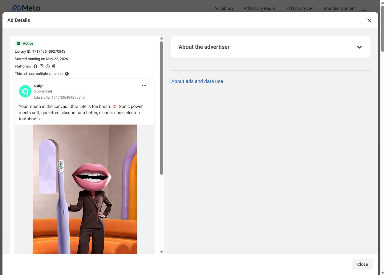
Your mouth is the canvas. Ultra Lite is the brush. 🎨 Sonic power meets soft, gunk-free silicone for a better, cleaner sonic electric toothbrush.
Shop NowTeardown
Quip's "A masterpiece in design" Meta creative dispenses with every technique that defines dental product advertising. There are no clinical efficacy claims, no ADA endorsement, no rotating brush-head demonstration, no comparative plaque-removal counter. The product — a lavender Quip Ultra Lite Sonic Electric Toothbrush — is positioned as a designed object rather than a medical device. The opening copy, "Your mouth is the canvas. Ultra Lite is the brush," sets up an art metaphor that the creative then literalizes: a 3D-rendered figure in a dark brown business suit stands at human scale next to an oversized toothbrush, its head replaced entirely by a pair of oversized pink lips. This is not accidental visual whimsy. It is a structured commitment to a single creative thesis — that this toothbrush belongs in the same mental category as a piece of furniture you would keep visible rather than hardware you would conceal.
The production choices reinforce that positioning at every layer. The lavender ("Meadow") colorway of the Ultra Lite anchors the product in a design-forward palette — the same tonal register used by premium apothecary brands, Scandinavian home goods, and fashion-adjacent wellness objects. Nothing in the frame references oral hygiene: no faucet, no mirror, no tile, no toothpaste tube. The background is warm beige interior with an orange velvet armchair — a home furnishing context, not a bathroom. The 3D character with lips-as-head does double work: it literalizes the copy (the mouth becomes the canvas, the brush becomes the instrument) and provides product scale — the Quip sits at roughly chest height on the figure, communicating the physical form factor of the Ultra Lite as a slim, architectural object rather than dental hardware. Quip's primary competitors have not run creative in this visual register. Their category language is clinical, kinetic, and efficacy-first. This creative is none of those.
The link card structure confirms the positioning frame. The domain text reads GETQUIP.COM; the headline is "A masterpiece in design" — art-world language deployed in a performance ad format. The sub-headline names the product in full: "The quip Ultra™ Lite Sonic Electric Toothbrush." The CTA is "Shop Now" with no urgency modifier, no limited-time qualifier, and no discount frame. The destination URL routes to the Meadow variant's specific product page — not a collection page, not a campaign landing page, but the exact colorway visible in the creative. That routing is evidence of conversion intent: this is a product ad, not a brand-awareness play, and the post-click path is matched to the creative asset precisely. The sharpest structural omission is subscription language. Quip's core business model is a refillable brush head subscription — replacement heads shipped on a recurring cadence. A subscription angle would be the standard rational for choosing Quip over a competitor at a comparable or higher price. This creative ignores it entirely. Instead of justifying the purchase on recurring-cost economics, the creative asks the audience to see the toothbrush as an object they would want to own for aesthetic reasons. That is a different conversion logic: desire-for-design rather than feature comparison or value calculation.
The ad runs across Facebook, Instagram, WhatsApp, and Threads simultaneously from a single image asset — four placements, one creative. That is a signal of budget confidence in the creative direction rather than platform-specific tailoring. Six ads in the campaign cluster use this creative and body text, suggesting Quip is testing a variable other than the creative itself — likely audience segment, bid strategy, or placement mix — rather than running creative variants against each other. The campaign started May 22, 2026, consistent with a product launch cycle or seasonal design-category push rather than a holiday or promotional-event anchor. The structural reason this creative exists is to build aesthetic authority before rational comparison begins. Competing on efficacy claims means entering territory where category incumbents have decades of clinical-trial data and institutional credibility. "A masterpiece in design" sidesteps that comparison entirely. It establishes a category — designed objects worth owning — in which neither Oral-B nor Sonicare has meaningful presence. That is how a challenger brand maintains durable consideration at a price premium: not by out-claiming incumbents on their own terms, but by competing on terms the incumbents cannot easily follow.