A masterpiece in design
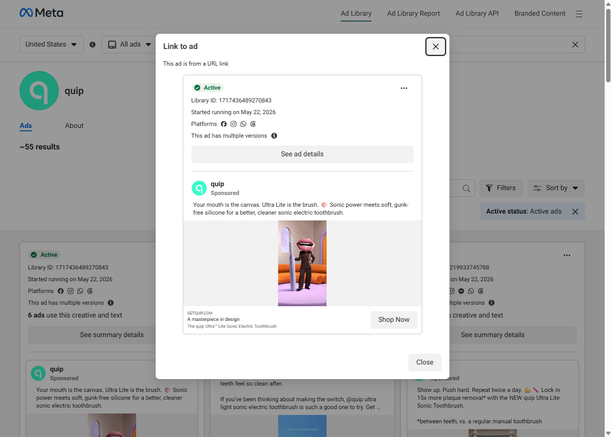
Your mouth is the canvas. Ultra Lite is the brush. 🖌 Sonic power meets soft, gunk-free silicone for a better, cleaner sonic electric toothbrush.
Shop NowTeardown
The quip Ultra Lite creative operates in a register most oral care advertising avoids entirely: surreal art direction applied to direct-to-consumer product positioning. "Your mouth is the canvas. Ultra Lite is the brush." is an art metaphor for a toothbrush, delivered in a creative that has materialized the metaphor literally. The 3D animation shows a humanoid figure with an oversized mouth for a head — lips, teeth, and the whole biological apparatus — wearing a dark business suit and standing in a stylized pop art interior next to a toothbrush so large it functions as set dressing. The metaphor and the visual are the same sentence rendered in two languages simultaneously.
This is not accidental aesthetic. quip (deliberately lowercase since its 2015 founding) has built its brand on the premise that dental care products are design objects, not medical supplies. The Ultra Lite toothbrush is marketed as "a masterpiece in design" — language borrowed from art criticism, not product specifications. The choice to animate a surreal conceptual scene rather than a clinical product demonstration is internally consistent with that brand logic: if you sell design objects, you communicate through design references and art-world vocabulary, not through ingredient lists, dentist endorsements, or before-and-after photography.
"Sonic power meets soft, gunk-free silicone" uses two language registers simultaneously. "Sonic power" is technical and positions the Ultra Lite in the premium tier of the electric toothbrush category — sonic vibration is a meaningfully different mechanism from oscillating heads or standard battery-powered bristles, and consumers who have researched oral care understand the distinction. "Gunk-free silicone" is deliberately informal. "Gunk" is a word you say to a friend complaining about their old toothbrush, not a word in clinical dental product copy. The tonal juxtaposition signals that quip knows its audience is skeptical of marketing language and is choosing to break the corporate register deliberately, demonstrating self-awareness before the viewer can deploy their own. Brands that call things "gunk" are making an implicit claim: we are not trying to sound like a health company.
The 3D animation is specifically suited to the art-metaphor argument because it allows the brand to construct a world that does not and cannot exist in photography. A mouth-headed figure in a suit is not an image that can be sourced from a stock library; it has to be built. The production choice to commit to full 3D animation for a toothbrush ad is itself a positioning statement: this brand has the aesthetic conviction to build a surreal universe for a $45 product.
The campaign clusters 6 ad versions sharing the same body copy, which is a horizontal scaling signal. quip is not A/B testing the conceptual frame; they are distributing a proven winner across multiple audience segments simultaneously. "GETQUIP.COM" in the link card domain slot is unambiguous about the purchase destination. The "A masterpiece in design" link card headline closes the art-metaphor loop that the body copy opens, ensuring that the viewer who arrived at the click point via the canvas-brush metaphor is still in the same conceptual register when they decide whether to click.
quip entered a market with dominant incumbents — Oral-B and Philips Sonicare — that hold decades of clinical positioning and dentist-endorsement equity. quip's strategic response was to abandon clinical framing entirely and compete on design identity instead. This ad is evidence the strategy is working at scale: you do not run 6 versions of a surreal mouth-headed animation at simultaneous distribution if the creative is not converting.