*Happy Sigh*
Teardown
The headline does a two-beat trick: "FITS LIKE IT WAS MADE THAT WAY." reads like a buyer's internal monologue — the thing you think when you discover that a Peak Design camera cube slides into a Peak Design backpack without a millimeter of wasted space. The second line, "BECAUSE IT WAS," is the brand's reveal. The subhead converts a user observation into a product truth. That structure — "you thought X, and X is actually literally true" — makes the viewer feel confirmed rather than sold to. It is a disclosure that rewards noticing. The alternative formulation, "engineered to work together," would be a brand claim. "Fits like it was made that way / Because it was" is the same claim delivered as a shared experience.
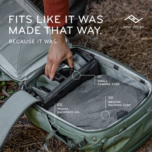
The creative is a hybrid format: outdoor lifestyle photography annotated with numbered product callouts. A hand reaches into an open sage-green Travel Backpack 45L on a pine needle ground. Three labeled components are identified with connecting dots and labels: 01. Small Camera Cube, 02. Medium Packing Cube, 03. Travel Backpack 45L. The numbered callouts are borrowed from technical schematic language — the kind used in assembly instructions and engineering drawings. Applied to a lifestyle photograph, they convert a warm aspirational image into a functional product demonstration simultaneously. The viewer gets the outdoor-adventure emotional register and the "here is exactly how the system works" argument in one frame.
The ecosystem argument is the structural purpose of the whole creative. The Camera Cube and Packing Cube are separate SKUs from the Backpack. Showing all three together — numbered, labeled, nested — makes the case that Peak Design has designed a complete travel system, not a collection of products that happen to be compatible. The "Obsessively engineered for no wasted space" body copy is the engineering claim. The annotated interior of the bag is the proof. Copy and creative are saying the same thing from two different angles simultaneously.
The outdoor context — pine needles, sage green, rust fleece — does not limit the product's use case. It extends its credibility. A bag that works in this context works everywhere. The outdoor signal is not about the buyer being a hiker; it is about the product being robust enough for demanding use. At the price point where Peak Design competes, buyers are evaluating for durability and long-term value. The outdoor setting does the durability argument without a word of durability copy.
The link card headline, "*Happy Sigh*," is a deliberate formatting choice. The asterisks encode it as an aside — a simulated stage direction, the kind of annotation someone types in a product review when they have exhausted specific praise and are left only with an emotional response. Put in a link card headline, a position normally occupied by product names or discount callouts, it creates a pattern break that reads more like a customer comment than a marketing line. "Guaranteed for Life" follows it as the rational close. The sequence is: emotion first (the sigh), then the reason the emotion is defensible (lifetime guarantee). The link card runs a compressed want-then-justify arc in two phrases.