Cloud Cotton Robe in Moss size Small | Parachute Home
Teardown
The primary text is one sentence: "Timeless essentials designed for daily comfort. Simple, beautiful, and made to last." Three clauses. Each one does a different job. "Timeless essentials" is the category positioning — not trendy, not seasonal, not disposable. "Designed for daily comfort" is the use frequency argument — this is not a guest bathroom robe, it is a Tuesday morning robe, a robe for the day you work from home. "Simple, beautiful, and made to last" is the product promise compressed to its minimum viable form. Parachute does not elaborate. The brevity is itself the brand statement: we do not need to convince you with paragraphs because the objects speak when you hold them.
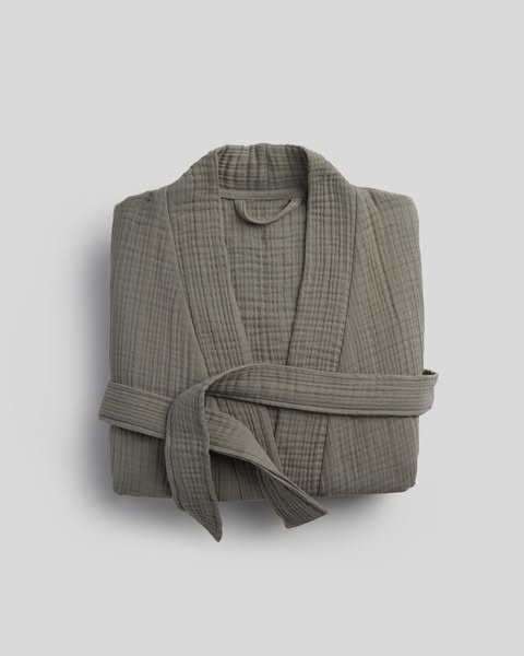
The creative is a product-on-white shot of the Cloud Cotton Robe in Moss, folded and belted, photographed from a slight overhead angle against a warm gray-white ground. No room, no person, no morning light filtering through curtains. Just the robe. The choice to strip context entirely puts the object's materiality at the center of the frame. The double-gauze construction — Parachute's Cloud Cotton weave — is visible in the photography: the texture reads as softness from a thumbnail. That textural legibility is the whole argument. A viewer who cannot feel the robe in person needs the photography to carry that signal. It does.
The moss colorway is doing category work that no copy could replicate as efficiently. Moss is not a trending color — it is a considered one. It sits in the same register as sage, loden, and stone: the palette of objects meant to be lived with rather than noticed. A buyer drawn to moss is a buyer who has already decided against loud branding and seasonal refreshes. The color self-selects for the customer Parachute wants: someone replacing a robe they wore out rather than someone buying their first one.
This ad runs as one version in a six-version dynamic catalog set — the same primary text fires against different SKUs including bath mats, other robes, and bedding. That structure reveals the strategic logic behind the copy's deliberate vagueness. "Timeless essentials designed for daily comfort" works for a robe, a tub mat, and a fitted sheet without modification because it describes the brand's thesis, not any specific product. The link card handles SKU specificity: "Cloud Cotton Robe in Moss size Small | Parachute Home" tells a viewer exactly what they are clicking toward. The primary text earns broad brand interest; the link card collects it at a specific SKU. The ad knows which element to make general and which to make specific.
The link card subtext reads "Shop What's Trending" — an unusual phrase in an otherwise restrained execution. It introduces a mild recency signal ("trending") into a brand built on the argument that quality does not trend. The tension is not accidental. It gives the algorithm a social proof hook without forcing Parachute to write FOMO copy in its own voice. "Shop What's Trending" lives in the link card metadata, not in the brand-controlled primary text. The brand keeps its tone; the placement layer gets its urgency signal. The two registers coexist without contaminating each other.