Flavor in full bloom
Teardown
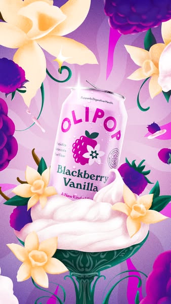
Olipop's Blackberry Vanilla "from the archives" creative makes a structural argument with its format choice before the copy lands. The image is an illustration — not a photograph, not a CGI render, but a commissioned painting in the tradition of confectionery art. A lavender-tinted Blackberry Vanilla can sits in a crystal coupe filled with soft-serve, surrounded by oversized vanilla blossoms and deep-purple blackberry clusters against a radiant, ray-burst background. The decision to illustrate rather than photograph is a category-positioning statement. Every major soda brand — Pepsi, Coke, Dr Pepper — runs product photography. Olipop runs botanical art. The format alone signals that Olipop is not competing in the same register as legacy sodas. It is positioning itself in the same shelf space as artisan beverages, premium ice cream, and heritage confectionery. The illustration format does the premiumization work that a health-claim bullet list cannot.
The body copy — "From the archives: fan-favorite Blackberry Vanilla is here to stay" — compresses three persuasion techniques into one sentence. "From the archives" frames the returning flavor as something that was missed, which creates retrospective demand. You did not know you missed Blackberry Vanilla until you were told it had been gone. "Fan-favorite" converts the relaunch from a brand inventory decision into a customer-demand response — the implication is that the community asked for this, not that the brand needed to fill a SKU slot. "Here to stay" closes the anxiety loop that a limited-time framing would have opened: this is not a seasonal drop, it is a permanence announcement. Three moves, one sentence, no wasted words.
The headline "Flavor in full bloom" runs parallel to the botanical illustration rather than describing the product. It does not say "Blackberry Vanilla is back" or "taste the difference." The bloom reference is the visual translated into words — vanilla flowers, blackberry bursts, the ice cream coupe as a garden vessel. When the headline and the image say the same thing in two different languages simultaneously, the claim lands without friction. The viewer's reading apparatus confirms what the visual system already processed. The absence of nutritional callouts, fiber claims, or ingredient overlays is deliberate: this creative is not the education ad. It is the desire ad.
The "Shop Now" CTA identifies this as lower-funnel inventory. Olipop runs "Learn More" on cold-audience awareness creative — the fiber-education video active in the same campaign window is the entry point for unconverted audiences. "Shop Now" skips the education phase and routes to purchase. It is targeted at an audience already warm on Olipop who needs a flavor reason to click, not a brand reason. The Blackberry Vanilla relaunch provides the flavor reason. The illustration provides the emotional permission. Running a fiber-education video for cold audiences alongside a botanical illustration for warm audiences in the same campaign window is a two-touch acquisition stack: the first ad builds category understanding, the second ad triggers the purchase event.
The stories format (338×600) tells the rest of the story. Stories inventory prices lower than feed on Meta in most DTC verticals. For a returning-flavor announcement targeting a warm audience, Olipop is buying high-frequency placement at a cost-efficient rate rather than paying feed premiums to reach people who already know the brand. The full-bleed botanical fills the phone screen exactly as the stories format demands — the illustration, which might feel overproduced in a feed slot, is calibrated to the placement. Creative dimensions, placement cost, and targeting assumption are aligned. Every element of this ad reflects a decision about who is being reached, what they already know, and what it costs to reach them at that stage of the funnel.