Get Up To 43% & A Free Frother
Teardown
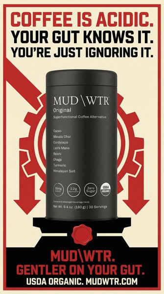
The creative is a constructivist propaganda poster. Red downward arrows cascade around a matte-black MUD\WTR can against a cream background — the visual grammar of revolutionary agitprop applied to a beverage category. The design reference is deliberate. Constructivism was a movement that used bold, geometric visual design to shift mass consciousness. MUD\WTR is using the same aesthetic to shift consumer consciousness away from coffee. The creative says what the category refuses to say: instead of "try our new product," it says "your current product is the problem."
The headline at the top runs three sentences with escalating accusation: "COFFEE IS ACIDIC. YOUR GUT KNOWS IT. YOU'RE JUST IGNORING IT." Each sentence does a different job. The first is a fact claim — coffee is acidic at a pH between 4.5 and 6.0, a chemically verifiable statement. The second personalizes the fact — "your gut" — converting an abstract chemistry claim into a bodily statement. The third is the accusation: you are in denial. That accusation is what separates this headline from standard competitor comparison copy. It does not say coffee is worse than MUD\WTR. It says coffee is hurting you and you have chosen to look away. A viewer who has had stomach trouble after coffee is being told their self-knowledge is correct and their choice to keep drinking is irrational. That is a more aggressive conversion argument than any discount.
The bottom of the creative mirrors the top: "MUD\WTR. GENTLER ON YOUR GUT. USDA ORGANIC." The image is a two-act argument in nine words — coffee hurts, MUD\WTR is gentler. The can in the center shows its full ingredient list at readable zoom: Cacao, Masala Chai, Cordyceps, Lion's Mane, Reishi, Chaga, Turmeric, Himalayan Salt. Nothing is redacted. The ingredient list is the product's proof. Brands that can display their full ingredient roster at this scale have a transparency argument that blends with proprietary matrices and E-numbered additives cannot make. MUD\WTR shows its hand because its hand is good.
The body copy runs a parallel but structurally distinct argument from the creative — not attacking coffee, but building the gut-health case from first principles. "About 70% of your immune system lives in your gut, and your gut makes over 90% of your serotonin" converts gut health from a wellness trend into a systems argument. The gut is not a digestive organ — it is an immune organ and a neurochemical organ. MUD\WTR positions itself at the intersection of both. The body copy closes with the only taste claim in the entire ad: "did we mention it tastes like dark chocolate with chai?" That placement is structurally deliberate. Taste claims front-loaded signal a product that has nothing else to offer. A functional argument followed by a taste close says: the reason to buy is what it does; the fact that it also tastes good is a bonus. That sequence protects the premium positioning even in a sale context.
The link card completes the funnel in three lines: "Get Up To 43% & A Free Frother / Over 50,000 5 Star Reviews / Shop now." The propaganda poster handles brand displacement — make you distrust coffee. The body copy handles category education — give you the gut-health framework to justify the switch. The link card handles conversion — discount, social proof, CTA. Each creative element holds a discrete job in a three-part funnel. The creative is not trying to do all of it at once. It is the first move in a sequenced argument that ends at the checkout.