Small Tweaks. Big Flavor. Built for repeatable results.
Teardown
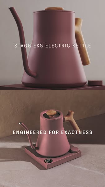
Fellow's Stagg EKG ad is a double-frame product shot that makes a sequential argument in the space normally occupied by one image. The top half shows the kettle isolated against a warm gray surface, photographed from above and at an angle: the sculptural gooseneck, the walnut-inset handle, the matte dusty rose finish. Text reads "STAGG EKG ELECTRIC KETTLE." The bottom half shows the same kettle from the front, sitting on its base with the control interface visible. Text reads "ENGINEERED FOR EXACTNESS." The two frames run a want-then-justify sequence inside a single static image. The top frame creates desire for the object. The bottom frame delivers the rational argument for buying it. The viewer's eye moves top to bottom and arrives at "exactness" as the reason the desire is defensible.
"Engineered for exactness" is a precise word choice in a category that defaults to "precise." Every high-end kettle brand claims precision. "Exactness" is a register upgrade — it implies engineering discipline applied to a calibrated tolerance, not marketing language for "accurate." The distinction matters because Fellow's buyer is comparing against Breville, Ratio, and Fellow's own prior generation. In a comparison at this price point, word choice carries weight. "Exact" outscores "precise" on the specificity index, and "engineered" implies a deliberate calibration process rather than a product that happens to be accurate.
The body copy educates at mechanism level: "Even the smallest adjustment in flow rate affects bloom, body, and taste." Bloom — the CO2 release when hot water contacts freshly-ground coffee — is specialty-coffee vocabulary that general consumers do not use. Placing "bloom" in the body copy without a definition is a targeting signal. The ad is written for people who grind their own beans, who understand pre-infusion, who would recognize why flow rate and bloom time interact. This is not a cold-audience creative. It is running to a segment of Meta users who have previously engaged with specialty coffee content or been retargeted from a Fellow product page. The technical register is appropriate to that audience and would be noise to anyone outside it.
The creative shows no person using the kettle, no cup being poured, no kitchen context. There is only the object. That choice is calibrated to the product's price position. At the Stagg EKG's retail price, the purchase is driven by design and engineering credentials, not by aspirational lifestyle association. The buyer at this price point already has the lifestyle. They are acquiring the tool that fits the identity they already hold. Showing only the tool — nothing else — respects that psychology without patronizing it.
The color makes the same argument without a word. Matte dusty rose is a counter-display color, not a cabinet color. The Stagg EKG is designed to sit on the counter as a functional design object. The color choice does the kitchen-as-gallery positioning work that no line of body copy could execute as efficiently. A viewer who responds to dusty rose as a design signal self-selects for Fellow's full product ecosystem — each piece of which shares the same counter-residency assumption. The ad is not selling a kettle. It is selling membership in a household aesthetic.