No credit check. No interest. Just $25 - $500 when you need it.
Teardown
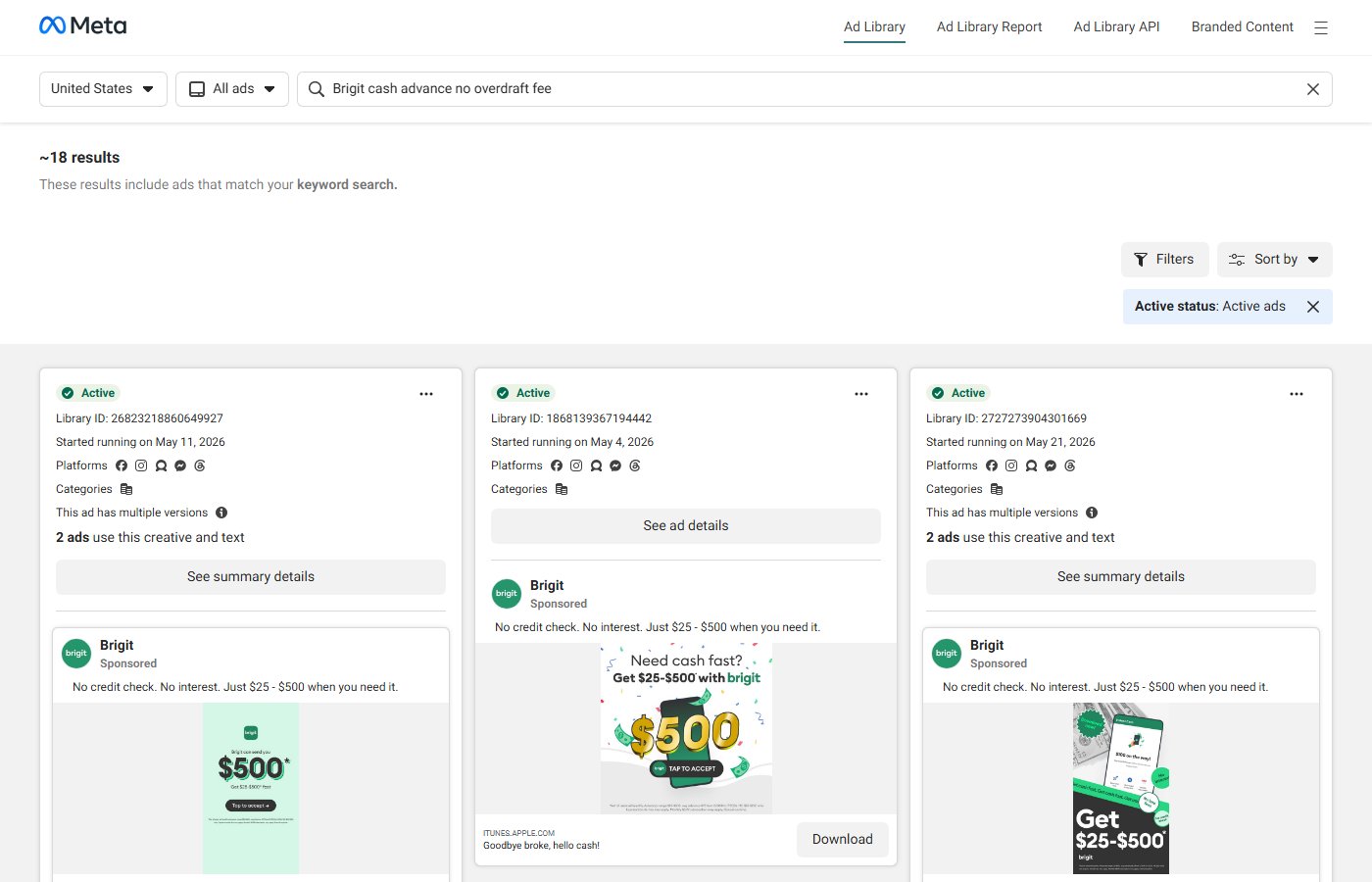
"No credit check. No interest. Just $25 - $500 when you need it." This headline is structured entirely around objection elimination. Every clause removes a barrier that would prevent a cash-strapped consumer from downloading a cash advance app: "No credit check" removes the fear of being denied (or having a hard inquiry damage an already-fragile credit score), "No interest" removes the fear of ending up worse off than before, and "Just $25 - $500" removes the fear of commitment to a product they don't understand by giving a concrete, bounded range. The word "Just" in the third clause performs double duty — it signals simplicity and also minimizes the ask, framing the advance as a small, manageable tool rather than a dangerous financial product.
The copy is designed for an audience with financial anxiety. Fintech advertising generally splits between aspirational (investing apps, wealth management) and practical (banking, cash advance). Brigit is firmly in the practical register, and the copy reflects that with zero lifestyle language. There is no aspirational imagery of financial freedom, no story of someone who got out of debt — there's just a direct, clear, honest offer. This is high-trust copywriting for a low-trust context. Cash advance apps exist in a category burdened by predatory lending associations, and Brigit's copy addresses that distrust head-on by leading with what they don't do (charge interest, run credit) before stating what they do.
"Need cash fast? Get $25-$500 with brigit" in the visual is a secondary hook that uses question format to establish urgency. The question format engages the reader actively — it creates a moment of self-identification ("yes, actually I do need cash fast") that immediately follows with the solution. The visual itself is bright, high-contrast, and designed for immediate comprehension: the dollar amount is the largest text element, the brand name is lowercase and friendly, and the color palette (green, a classic money/go color) reinforces the message without ambiguity.
The ITUNES.APPLE.COM URL and "Goodbye broke, hello cash!" display text positions this as an iOS app install campaign. "Goodbye broke, hello cash!" is a tagline with momentum — it maps the journey from problem state to resolution in five words. The campaign ran across three ad units with the same body copy, suggesting Brigit is testing visual variations (the $500 dollar sign animation vs. the phone mockup) while the copy remains the control.